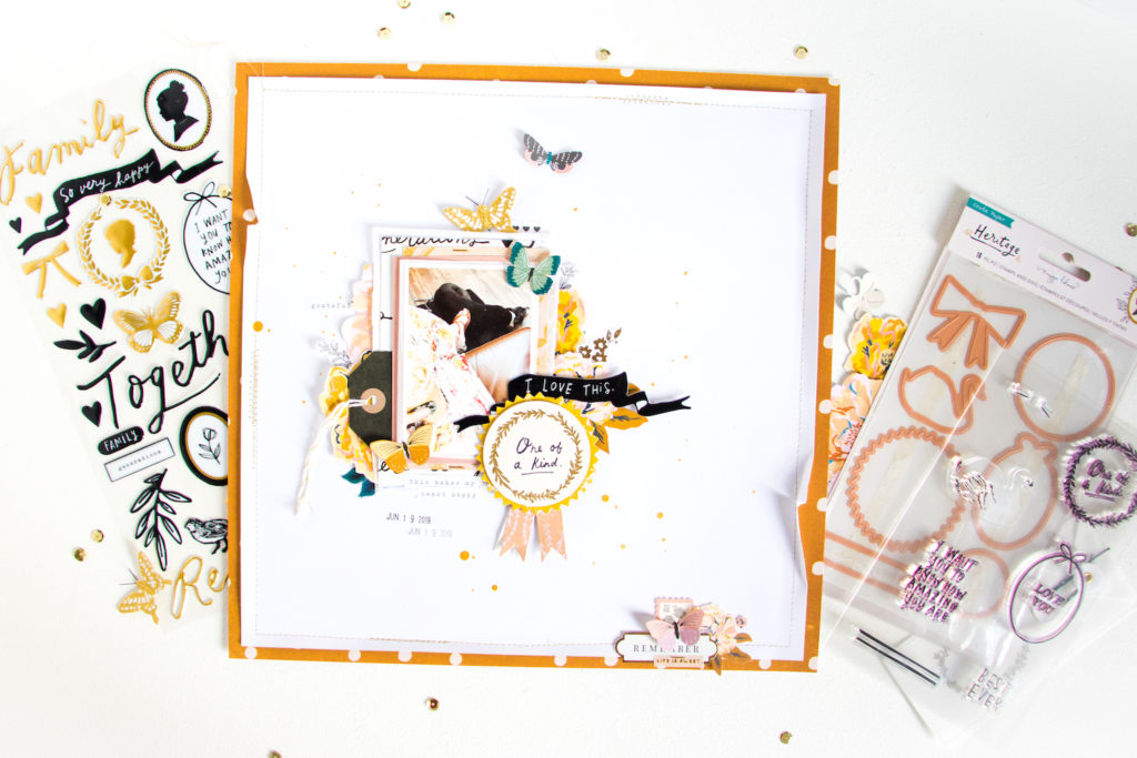
Hey everyone, it’s Kathleen back with you today and I have another layout made with the Heritage collection to share. And if you’ve been following me for a while and have seen some of my layouts, you will know that I’m a big fan of white space and layering! So I thought I would share some tips and tricks for the two with you.
Layering Tips & Tricks
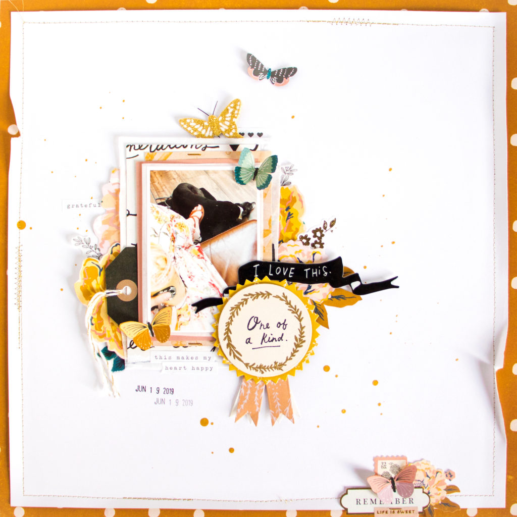
Let’s first talk about layering! There are lots of things you can layer on your layouts: papers, embellishments, tags, etc. Here are a few tips for creating layers:
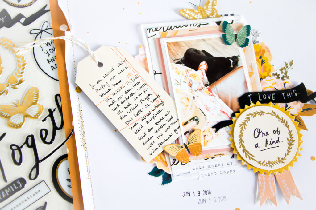
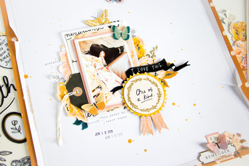
- start by adding various pieces of patterned paper behind your photo. try mixing soft or neutral colors with darker ones and small patterns with large ones.
- to help your photo stand out, add a piece of white tissue paper or cardstock directly behind it to visually separate it from the paper layers.
- slide in a tag between the paper layers that you can also use for hidden journaling.
- let die cuts or fussy cut pieces peek out from in between and behind the paper layers for even more dimension.
- create a layered embellishment cluster on a different spot on your layout that repeats elements from your main cluster (i.e. the photo cluster).
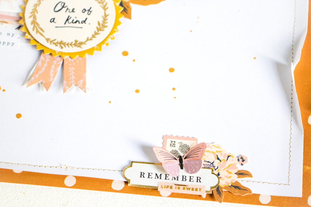
With the stamp set from the Heritage collection you can also create your own layered embellishments. The “One of a kind” prize ribbon that I added to the corner of my photo was really easy to make with the stamp and die set!
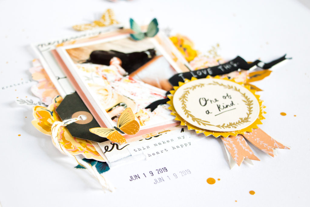
I simply die cut the pieces from some patterned papers that fit the colors of the layout and then stamped the wreath and sentiment on top. I also heat embossed the wreath with gold embossing powder. Using foam adhesive I attached the different layers for even more depth and dimension.
White Space
As mentioned before, I often use white space on my layouts. Especially when I have a lot of layers, colors or patterns going on, I feel like the white space helps to balance it out and makes the layout more harmonious.
By the way, white space doesn’t necessarily mean that it has to be white! You could also say it’s “empty space”, i.e. space where you don’t add any embellishments or photos.
Using white space helps to draw the viewer’s eyes to your photo cluster, since that’s bascially where the “action” is. It also gives their eyes a place to rest. So the next time when you feel your layout is too busy, try using white space and see if it feels better!
I hope these tips and tricks for layering and white space help you. Let me know if you have any questions! Thanks a lot for stopping by! Xo, Kathleen
Supplies used: Maggie Holmes Heritage Collection: 12×12 Paper Pad / Stamp & Die Set / Ephemera / Gold Glitter Butterflies / Puffy Phrase Thickers / Generations Paper / Perennial Paper / Recollection Paper / Margaret Paper / Keepsake Paper / Handwritten Paper // Maggie Holmes Sticker Book Vol. 2